
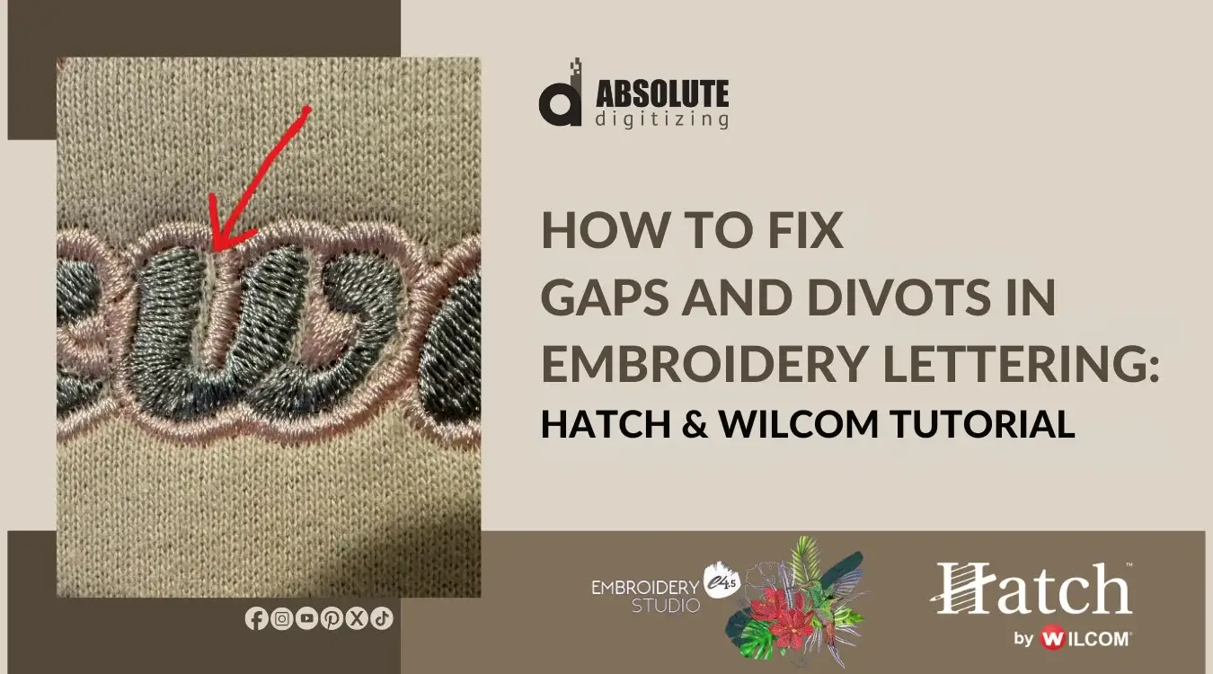
| Quick Summary |
|---|
Lettering gaps and divots happen when stitch settings, fabric, and corner shape do not work together.
|
Digitized lettering can look perfect in Hatch or Wilcom, but the real stitch-out may look different. You may see tiny gaps, small dips, or weak corners that make clean text look rough.
Most of the time, one setting will not fix the full problem. Pull compensation, underlay, density, fabric type, stitch angle, and corner style all work together.
In this guide, we will show you how to find the real cause and fix it step by step. And if you prefer to skip the trial and error, an embroidery digitizing professional can rebuild the file for a cleaner sew-out.

- Why Do Lettering Corners Get Gaps and Divots?
- What Is the Difference Between Gaps and Divots in Embroidery Lettering?
- Why Do Lettering Corners Look Fine on Screen but Bad After Stitching?
- Step-by-Step Guide to Fix Lettering Gaps and Divots
- Common Mistakes That Make Lettering Corner Gaps Worse
- Hatch or Wilcom: What Settings Should You Check First?
- How Can Professional Digitizing Help Fix Lettering Gaps?
- Final Thoughts
- FAQs
Why Do Lettering Corners Get Gaps and Divots?
Gaps and divots in lettering corners happen when the stitches fight the fabric. Satin stitches pull inward as they sew. So, a corner that looks full on screen may stitch with a small open space.
The problem can also come from weak underlay, poor stitch angles, or too many stitches packed into one sharp point.
Check these areas before you edit:
- Fabric and stabilizer
- Pull compensation
- Underlay type
- Letter size
- Stitch angle
- Corner shape
Hatch and Wilcom both let you adjust pull compensation and underlay through object properties or stitch settings.
What Is the Difference Between Gaps and Divots in Embroidery Lettering?
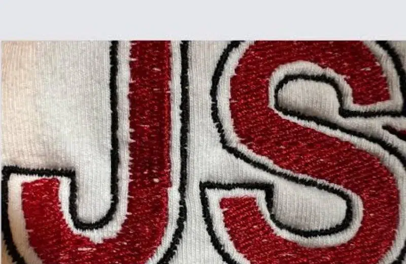
Gaps are small white spaces in stitched letters. They often appear near sharp corners, letter joins, outlines, or inside narrow strokes.
Divots look different. They are small scooped or dipped areas where a corner should look full and smooth.
What you may notice
- Open spots near A, V, W, M, N, K, E, R, S, or O
- Small scooped areas where a corner should look full
- Weak points in script letters or serif fonts
These problems often show on left chest logos, caps, polos, towels, fleece, and small text embroidery. They can make neat lettering look uneven after stitching.
Why Do Lettering Corners Look Fine on Screen but Bad After Stitching?
A screen preview shows the stitch path, but it cannot show every fabric move. When the needle goes in, thread tension can pull the fabric inward. This pull can create gaps. Pull compensation adds extra stitch width past the outline, so the sewn shape stays filled.
1. The fabric pulls inward
Soft, stretchy, or loose fabric can move more during stitching.
2. The underlay is too weak or too heavy
A weak underlay gives poor support. Heavy underlay can build bulk in small letters.
3. The satin column is too narrow
Thin columns can shrink and leave open spots.
4. The corner has poor stitch direction
Bad angles can make corners look dipped or uneven.
Step-by-Step Guide to Fix Lettering Gaps and Divots
Step 1: Check the Shape and Nodes First
Before changing stitch settings, check the letter shape closely. A bad outline can create gaps, dips, and rough corners even when the underlay, density, and pull compensation look correct.
Zoom in on the problem area. Then look at the corner, curve, and satin column shape. If the outline has too many nodes, the stitch path may turn rough. However, if a node sits in the wrong place, the corner may pull out of shape.
What to check
- Zoom in closely on the problem area.
- Check if the corner shape looks smooth.
- Remove unnecessary nodes.
- Move badly placed nodes.
- Avoid sharp bumps in the outline.
- Keep curves simple and clean.
- Make sure both sides of the satin column flow naturally.
Also, do not add more stitches to cover a badly drawn shape. As a result, fix the outline first, then adjust the stitch settings.
Step 2: Check the Letter Size Before Changing Settings
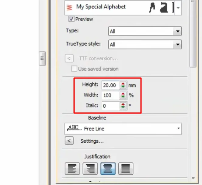
Check the letter size before you change pull compensation, density, or underlay. Small text does not sew like large text. Very tiny letters need a simpler stitch plan because narrow satin columns can close up, shrink, or lose shape.
Why size matters
- Small letters need fewer details.
- Thin satin columns can pull inward.
- Tiny corners can lose their sharp shape.
- Large text can handle more support.
“Hatch recommends run stitch fonts for lettering under 5 mm, where satin columns may not work well. It also recommends small fonts at 6 mm and below with push and pull adjustments.“
Size guide
| Letter size | Best starting point |
|---|---|
| Under 5 mm | Use a run stitch or a very simple small font |
| 6 to 10 mm | Use center-run underlay |
| Over 10 mm | Use edge-run underlay |
| Large block text | Add a stronger underlay if needed |
Step 3: Adjust Pull Compensation in Hatch or Wilcom
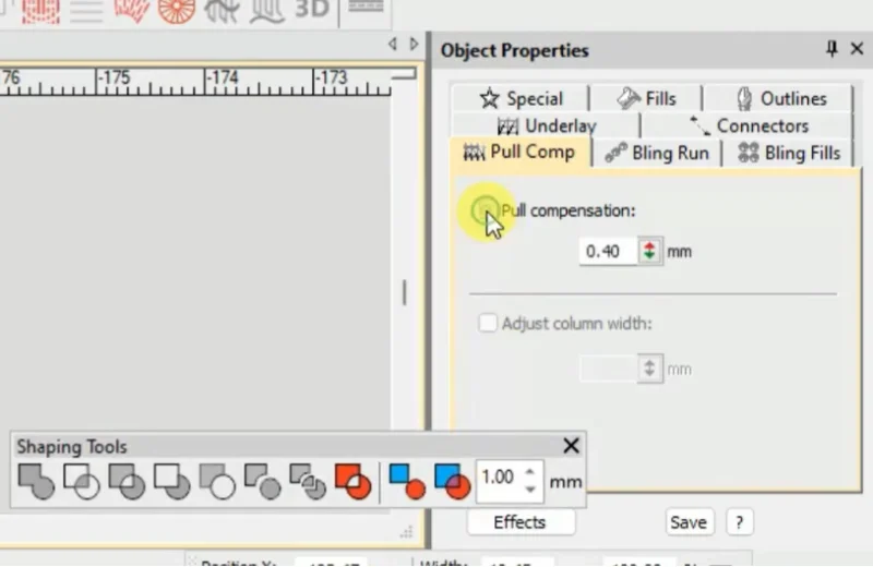
Pull compensation adds a small amount of extra stitch width. It helps the sewn letter stay full after the fabric pulls inward. Without it, corners can look thin, dipped, or open.
Wilcom gives a general lettering range of 0.2 to 0.3 mm. Still, do not use one number for every job. The best setting can change with fabric, hooping, backing, topping, thread tension, and satin column width.
In Hatch
Select the lettering object. Open Object Properties. Go to the Stitching tab and adjust Pull Compensation. Make a small change, then check the stitch preview and sew a test.
In Wilcom
Select the lettering or satin object. Open Object Properties and adjust Pull Compensation. In newer Wilcom versions, twin-sided pull compensation can help when one side of a letter sits on fabric and the other side sits over stitched areas.
Quick tip
- Increase it slowly.
- Test on the real fabric.
- Do not use pull compensation to hide poor underlay.
Step 4: Choose the Right Underlay for Lettering Corners
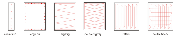
Underlay is the base that sits under top stitches. It gives letters support, adds lift, keeps stitches from sinking into soft fabric, and can flatten napped fabric, like towels or fleece.
1. No underlay for very tiny text
For lettering under 5 mm, skip underlay. Tiny letters need less thread, not more bulk.
2. Center-run underlay for small lettering
For 6 to 10 mm letters, use a center run underlay. It also works well for narrow satin columns.
3. Edge-run underlay for larger lettering
For letters over 10 mm, use edge-run underlay. It supports the edges and helps corners hold shape.
4. Zigzag underlay for wide satin strokes
Use zigzag underlay when satin strokes get wider. It supports broad columns, while center-run helps stabilize narrow 2 to 3 mm columns.
Quick check
- Small text needs light support.
- Wide text needs stronger support.
Watch this helpful Hatch lettering tutorial to see how underlay, compensation, and connectors affect the way embroidered text sews out.
Step 5: Fix Sharp Corners with Smart Corners, Mitre, Cap, or Lap
Sharp lettering corners can cause trouble during stitching. Too many stitches can bunch up at one point. This can make hard spots, rough edges, weak corners, or even needle stress.
This often happens in letters like A, V, M, N, W, and K. Serif fonts can also show this issue because they have small points and sharp ends.
Corner guide
| Corner type | Best use |
|---|---|
| Mitre corner | For clean 75 to 90 degree satin corners |
| Cap corner | For very sharp points |
| Lap corner | For segmented or Tidori style corners |
| Rounded corner | For softer corners that keep thread flow smooth |
So, do not leave sharp corners alone. Choose the corner style that matches the letter shape.
Step 6: Clean the Stitch Angles and Reshape Weak Corners
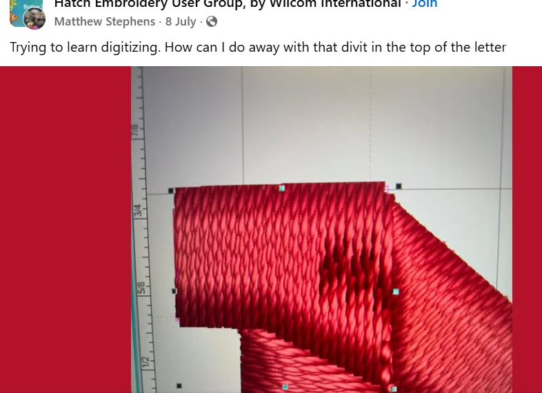
Corners need clean stitch flow. If the stitch angle changes too fast, the corner can look thin, dipped, or jagged. The line made by needle points also affects how satin fills look.
Satin works best on narrow shapes where each stitch crosses the column width.
What to clean up
- Use the Reshape tool to fix weak corners.
- Remove extra nodes that make rough turns.
- Avoid tiny hooks and sharp artwork points.
- Keep satin columns smooth and even.
- Add a small overlap where letter parts join.
- Do not depend only on auto digitized TrueType fonts.
These small edits can make lettering sew cleaner.
Step 7: Fix Nodes and Add Overlap at Letter Joins
Nodes control the shape of each letter. If a corner has too many nodes, the stitch path can turn rough. However, if it has too few, the corner may lose its shape.
Overlap also matters where two letter parts meet. Without a small overlap, fabric pull can open a gap after stitching. Because of this, joins in letters like A, K, R, S, and serif fonts need extra care.
What to check
- Remove extra nodes near sharp corners.
- Smooth rough curves before stitching.
- Add small overlap at joined parts.
- Avoid tiny hooks in the artwork.
- Test sew after reshaping.
Step 8: Balance Density and Stitch Spacing
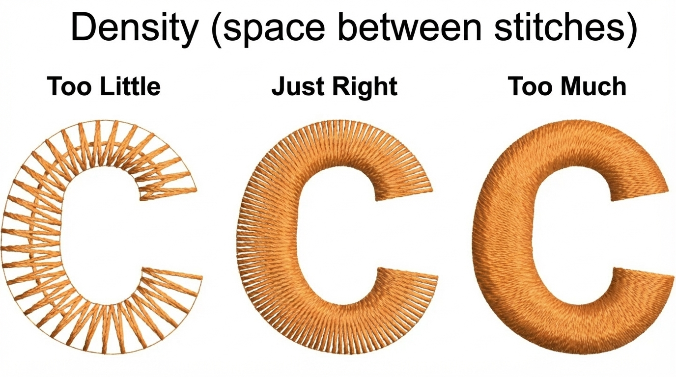
Density can help, but it is not always the fix. Too little stitch density can leave small gaps. Too much density can make corners hard, bulky, or puckered.
Satin spacing should match the column width. Stitch shortening can also help in tight turns. It spreads stitches better, so the inside edge does not bunch too much.
What to adjust
- Increase density only a little.
- Do not pack sharp corners with extra stitches.
- Use stitch shortening where the corner turns tight.
- Test after each small change.
- Keep small letters soft enough to bend with the fabric.
This keeps lettering clean without making it stiff.
Step 9: Test Sew on the Same Fabric
A test sew shows how lettering behaves on the real item. The same file may stitch clean on cotton but show gaps on pique, fleece, caps, towels, or stretchy fabric.
Stretchy fabric and larger stitch areas often need more support than firm fabric or small designs. That is why you should test before production, not after an order is finished.
Test sew checklist
- Use the same fabric.
- Use the same stabilizer.
- Use the same thread.
- Use the same hooping method.
- Check corners after washing if needed.
- Mark which setting fixed the issue.
This helps you repeat the clean result. Clean lettering takes careful stitch planning, not just one quick setting change. If your logo text still shows gaps, divots, or weak corners after testing, Absolute Digitizing can prepare a smoother, machine-ready embroidery file with proper underlay, pull control, and clean stitch flow.
Common Mistakes That Make Lettering Corner Gaps Worse
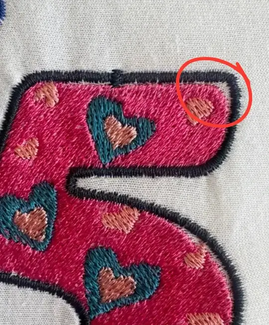
Small lettering problems can get worse when you fix the wrong setting. A gap may look like a density issue, but the real cause may be fabric pull, weak support, or poor corner shape.
Mistakes to avoid
- Increasing density too much.
- Using edge-run underlay on very tiny letters.
- Ignoring the fabric type.
- Using thin print fonts instead of embroidery fonts.
- Leaving sharp artwork points untouched.
- Using the same pull compensation on every fabric.
- Skipping a test stitch.
- Trusting the preview without checking the real sew-out.
- Using too many trims or connectors in small text.
Fix one thing at a time, then test again.
Hatch or Wilcom: What Settings Should You Check First?
Start with the problem you see in the stitch-out. Then check the setting that controls that issue. This saves time and helps you avoid random edits.
Quick setting guide
| Problem | Hatch setting to check | Wilcom setting to check |
|---|---|---|
| White gap in corner | Pull Compensation | Pull Compensation |
| Letter sinks into fabric | Underlay | Auto Underlay |
| Sharp corner bunches | Reshape or stitch angle | Smart Corners |
| Small text closes up | Font size or run stitch font | Lettering underlay or font size |
| Uneven satin edge | Density or stitch spacing | Spacing or shortening |
How Can Professional Digitizing Help Fix Lettering Gaps?

Some lettering gaps need more than a quick setting change. However, a professional digitizer can rebuild the stitch path, shape weak corners, and plan the design for the real fabric.
Also, they can adjust the file based on fabric, size, and stitch flow.
What a digitizer can fix
- Manual stitch path planning
- Pull compensation based on fabric
- Better underlay for small or large letters
- Cleaner satin column shapes
- Fixed stitch angles and corner flow
- Fewer trims and cleaner connectors
- Stitch-ready files for caps, polos, towels, fleece, or left chest logos
As a result, the lettering can sew with fewer gaps, dips, and rough edges.
Final Thoughts
Gaps and divots in lettering corners can make a good design look unfinished. However, you can fix most issues by checking the letter size, fabric, underlay, pull compensation, stitch angles, corner style, and density.
Also, always test sew on the same fabric before you run the final order. This helps you catch small problems early and avoid wasted garments.
The main takeaway is simple: clean lettering comes from smart stitch planning, not guesswork.
If your text still looks weak or uneven, Absolute Digitizing can help. Contact us today or get a free quote for clean, machine-ready embroidery digitizing.
FAQs
Gaps often happen when satin stitches pull the fabric inward. Weak underlay, poor stitch angles, or sharp corners can also cause open spaces. Because of this, check fabric support before changing many settings.
Start with the letter shape and stitch direction. Then adjust pull compensation, underlay, and density in small steps. Also, test sew the design on the same fabric before final production.
Very tiny text under 5 mm usually needs no underlay or a simple run stitch style. However, 6 to 10 mm letters often work better with center-run underlay. Larger letters may need edge support.
Yes, pull compensation can help fill gaps caused by fabric pull. However, it will not fix every issue. You still need the right underlay, clean corners, smooth stitch angles, and a real test sew.
The screen preview does not show all fabric movement. During sewing, thread tension can pull, push, or distort small letters. As a result, the final stitch-out may need manual edits, not just preview approval.