
Embroidery is all about details, and when it comes to small lettering, precision is everything. Whether you’re adding a brand name to a logo, stitching a monogram, or personalizing apparel, the quality of tiny text can make or break the final look. Unfortunately, small letters are one of the hardest elements to get right in embroidery. Many designs end up looking distorted, unreadable, or even lost in the fabric due to issues like improper stitch density, thread thickness, and fabric instability.
In this guide, we’ll walk you through the best techniques for digitizing small letters without losing quality. From selecting the right font and stitch type to optimizing machine settings, we’ll cover everything you need to know to achieve sharp, readable lettering in your embroidery projects. Let’s dive into the secrets of mastering small text in embroidery!
- 1. Understanding the Challenges of Small Lettering
- Minimum Size Considerations
- 2. Choosing the Right Font and Lettering Style
- 3. Selecting the Right Stitch Type for Small Letters
- 4. Adjusting Stitch Density and Underlay for Small Text
- 5. The Role of Thread, Needle, and Tension in Small Lettering
- 6. Best Machine and Software Settings for Small Lettering
- 7. Testing and Troubleshooting Small Letter Designs
- Conclusion

1. Understanding the Challenges of Small Lettering
Digitizing small letters for embroidery comes with several challenges that can affect readability and overall design quality. Here’s a closer look at the key factors that influence small lettering in embroidery:

Minimum Size Considerations
One of the biggest limitations of embroidered text is the size of the letters. Typically, fonts smaller than 4-5mm in height become difficult to read due to the limitations of thread thickness and stitch precision. When letters are too small, details get lost, stitches overlap, and text appears blurry or illegible.
Fabric Type Matters
The type of fabric used plays a crucial role in how small letters appear. Thin, stretchy, or loosely woven fabrics (like t-shirts or knits) tend to shift during stitching, causing letters to distort or sink into the fabric. On the other hand, stable, tightly woven fabrics (like twill or denim) provide a solid base, making small text clearer and more defined. Using proper stabilizers can also help maintain accuracy.
Thread Thickness & Needle Size
Standard embroidery thread (40wt) is often too thick for small lettering, leading to thread buildup that distorts the text. Using a finer thread like 60wt or 75wt allows for sharper details. Similarly, a smaller needle size (65/9 or 70/10) helps create clean, precise stitches without excess bulk.
Stitch Types That Work Best for Small Letters
Not all stitch types are suitable for small text. Satin stitches work well for letters around 4-5mm in height, as they create smooth, continuous lines. However, for text smaller than 4mm, a running stitch may be a better option, as it reduces density while keeping the letters legible. Fill stitches, on the other hand, should generally be avoided for small text, as they add unnecessary bulk and can make letters unreadable.
Common Mistakes That Cause Distortion
Several factors can cause small letters to lose quality:
- Wrong underlay settings: Without proper underlay, small text may sink into the fabric. A light edge walk or center run underlay can help maintain structure.
- Excessive stitch density: Overlapping stitches make letters look messy. Reducing density prevents thread buildup.
- Using the wrong font: Intricate, script, or serif fonts often don’t translate well into embroidery. Choosing a simple, block-style font ensures better clarity.
2. Choosing the Right Font and Lettering Style

Selecting the right font is one of the most important steps in digitizing small letters for embroidery. The wrong font can lead to unreadable, distorted, or bulky text, while the right choice ensures clarity and professionalism. Here’s what you need to know about choosing fonts and lettering styles for small text embroidery:
Best Fonts for Small Text: Sans-Serif Fonts Work Better

When digitizing small letters, sans-serif fonts (fonts without extra strokes or decorative edges) are the best choice. Fonts like Arial, Verdana, and Century Gothic provide clean and simple letterforms that stitch well even at small sizes. Their uniform thickness and smooth edges help maintain legibility.
Avoid Overly Detailed or Cursive Fonts
Intricate fonts, such as serif fonts (Times New Roman, Georgia) or cursive/script fonts, are not ideal for small embroidery because their fine details, curves, and flourishes tend to blur. The machine struggles to recreate those delicate details, leading to lost strokes and illegible text. If a customer requests a script font, it’s best to enlarge the text or simplify the design.
Bold and Simple is Better
Thicker, bold fonts work better than thin or highly detailed ones. Block fonts like Impact, Arial Black, and Tahoma provide more thread coverage, making the letters stand out clearly. Avoid fonts with excessive variations in stroke thickness, as they may not translate well in embroidery.
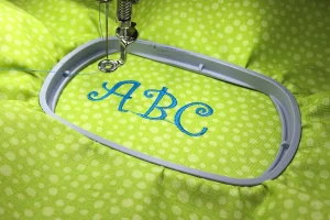
Capitalization Matters
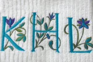
Using all capital letters (ALL CAPS) in small text can create legibility issues, as capital letters tend to be wider and closer together. Mixed-case letters (Upper and Lower) generally embroider better because lowercase letters often have more space between them, reducing the risk of overlapping or distortion.
3. Selecting the Right Stitch Type for Small Letters
Choosing the right stitch type is crucial when digitizing small letters for embroidery. Different stitches affect the clarity, density, and overall appearance of the text. Here’s a breakdown of the best stitch choices for small lettering:
Satin vs. Running vs. Fill Stitches: When to Use Each
There are three main stitch types used in embroidery: satin stitches, running stitches, and fill stitches. Each has its advantages and best-use scenarios:
- Satin stitches are ideal for most small lettering.
- Running stitches are useful for extremely tiny text.
- Fill stitches should generally be avoided for small letters.
Why Satin Stitches Are Best for Small Letters
For text that is 4-5mm or larger, satin stitches work best. They create a smooth, continuous line that enhances readability. Satin stitches follow the natural curves of letters, providing a crisp and clean look without excessive density. Additionally, the slight sheen of satin stitches gives small letters more definition against the fabric.
Using Running Stitches for Extremely Tiny Text
If letters are smaller than 4mm, satin stitches may become too bulky. In this case, running stitches (single-line stitches) can be used instead. Running stitches work well for very fine details or text below 3-4mm, but they should be carefully digitized to ensure consistent spacing and avoid breaks in the letters.
Avoiding Dense Fill Stitches
Fill stitches, which are typically used for large areas, are too dense for small lettering. They create a blocky, cluttered look that makes the letters unreadable. Instead of smooth curves, fill stitches result in jagged edges, which ruins text clarity.
Manual vs. Auto-Digitizing: Why Auto-Digitizing Can Ruin Small Text
Auto-digitizing software can misinterpret small text, resulting in excessive density, poor stitch paths, and unnecessary underlays. Auto-digitized small letters often come out distorted, bulky, or unreadable. Manual digitizing allows for precise adjustments to stitch type, density, and underlay, ensuring the letters remain sharp and clear.
4. Adjusting Stitch Density and Underlay for Small Text

Getting the stitch density and underlay right is critical when digitizing small letters for embroidery. Too much density can lead to thread bunching, distortion, and unreadable text, while the wrong underlay can cause letters to sink into the fabric. Proper adjustments ensure crisp, legible results.
How Too Much Density Ruins Small Letters
One of the most common mistakes in small lettering is using excessive stitch density. When too many stitches are packed into a tiny space, threads overlap, causing bunching, thread breaks, and distortion. Instead of clear, smooth letters, you end up with messy, unreadable text. Reducing stitch density prevents these issues and allows the letters to maintain their shape.
Ideal Density Settings for Small Letters
The right density settings depend on the size of the text. For satin stitch letters between 4-5mm, reducing density slightly (0.30mm to 0.40mm spacing between stitches) helps avoid excessive bulk. For smaller letters, running stitches are often a better choice since they don’t require high density. Testing different density levels based on fabric and thread type is crucial for achieving optimal results.
Proper Underlay Techniques: Edge Walk or Center Run for Stability
Underlay plays a key role in stabilizing small text. Without proper underlay, letters can sink into the fabric, making them less readable. The best underlay choices for small lettering include:
- Edge Walk Underlay: A light stitching path around the letter’s edges to support the satin stitch.
- Center Run Underlay: A single-stitch line running through the center of each letter to prevent it from collapsing.
Pull Compensation Adjustments: Preventing Letters from Shrinking or Stretching
Pull compensation is essential for small letters because fabric tension can cause text to shrink, stretch, or lose shape. Increasing pull compensation slightly (0.1mm to 0.2mm) ensures that the final embroidered text matches the original design, preventing letters from appearing too thin or distorted.
Using Test Runs to Fine-Tune Density and Underlay
Since different fabrics and threads react differently, always run a test stitch before production. Adjustments to density, underlay, and pull compensation can be fine-tuned based on the test results. Testing helps identify issues early and ensures high-quality results.
5. The Role of Thread, Needle, and Tension in Small Lettering
When digitizing and embroidering small letters, selecting the right thread, needle, and tension settings plays a crucial role in achieving crisp, readable text. Using the wrong combination can lead to thread breaks, blurry edges, or distorted letters. Here’s how to optimize each factor for small text embroidery.
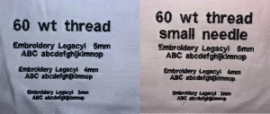
Choosing the Right Thread Weight: 60wt or 75wt for Sharper Details
Most embroidery projects use 40wt thread, but for small lettering, finer threads like 60wt or even 75wt provide better clarity and definition. A thinner thread allows for more precise details without excessive bulk, making the text appear sharper and more legible. Thinner threads also help when stitching intricate fonts or characters with tight spacing.
Best Needle Size for Small Text: 65/9 or 70/10 for Precision
Using a standard 75/11 embroidery needle may be too thick for tiny lettering, leading to distortion or lost details. Instead, smaller needles like 65/9 or 70/10 create finer, more precise stitches. A smaller needle ensures that stitches land exactly where they should, preventing thread from pulling too much fabric and causing letters to lose shape.
Adjusting Thread Tension: Preventing Breaks and Distortion
Proper thread tension is critical for consistent stitch formation in small lettering. If the tension is too tight, the thread may snap or pull the fabric, distorting the letters. If it’s too loose, stitches may look uneven or loop out. Adjusting the upper thread tension slightly looser while keeping bobbin tension stable helps maintain even stitches and prevents thread breaks.
Matching Thread Color to Fabric for Better Readability
Even if the letters are perfectly digitized and stitched, poor color contrast can make them difficult to read. Choosing a thread color that stands out against the fabric enhances visibility. Avoid using thread colors that are too close to the fabric shade unless you intend for a subtle effect. When stitching on textured fabrics, a slightly bolder contrast can help small letters appear clearer.
6. Best Machine and Software Settings for Small Lettering
Even with the right digitizing techniques, achieving sharp and legible small letters requires proper machine and software settings. Without the right configurations, small text can appear distorted, bulky, or unreadable. Here’s how to optimize your embroidery machine and software for the best results.
Digitizing Software Features That Help: Wilcom, Pulse, Hatch, Chroma

Professional embroidery software plays a critical role in small text digitizing. Wilcom Embroidery Studio, Pulse, Hatch, and Ricoma Chroma offer advanced tools that allow for:
- Manual density control to prevent stitch crowding.
- Precise underlay and pull compensation settings to maintain letter shape.
- Adjustments to stitch type and pathing for optimal clarity.
Using high-quality software ensures that every letter is digitized with accuracy, minimizing common issues such as overlapping stitches or poor letter formation.
Setting the Correct Stitch Length: 0.8mm–1.2mm for Optimal Results
Stitch length is crucial when working with small letters. For satin stitches, a stitch length of 0.8mm–1.2mm is ideal. If stitches are too long, they may pull and distort. If they’re too short, thread buildup can occur, making the letters unreadable. Running stitches (for text smaller than 4mm) should have a stitch length of around 1mm–1.5mm to prevent gaps.
Speed Settings for Embroidery Machines: Slower Speeds Prevent Distortion
Embroidery speed impacts stitch quality. For small lettering, slowing the machine down to around 500-600 stitches per minute (SPM) helps prevent thread breaks and distortion. Running the machine too fast increases the risk of stitches pulling the fabric, leading to misaligned or stretched-out letters.
Hoop Selection and Stabilization: Choosing the Right Hoop for Fabric Stability
A properly hooped and stabilized fabric is essential for small lettering. Using a tight, small hoop that keeps the fabric flat prevents shifting during stitching, ensuring letters stay aligned. Avoid loose hooping, as it can cause text distortion.
Backing and Topping Techniques: How Stabilizers Improve Letter Clarity
The right stabilizers help prevent letters from sinking into the fabric or becoming misshapen. Use:
- A firm cutaway stabilizer for stretchy or delicate fabrics.
- A medium-weight tearaway stabilizer for stable fabrics like caps or jackets.
- Water-soluble topping (WSS) on textured fabrics (like towels or fleece) to prevent stitches from getting lost in the material.
7. Testing and Troubleshooting Small Letter Designs
Even with the best digitizing techniques, small lettering embroidery requires testing and refinement to ensure clarity and readability. Tiny text is more sensitive to stitch density, fabric movement, and machine settings, making a test stitch-out essential before final production. Here’s how to test and troubleshoot small letter designs effectively.
Always Do a Test Stitch-Out: Small Letters Require Trial Runs
Unlike larger designs, small lettering doesn’t leave much room for errors. Before running the final production, always stitch out a sample on the same fabric type and stabilizer that will be used for the actual project. A test run helps identify potential problems like distortion, uneven stitches, or readability issues before committing to the final piece.
Fixing Common Issues: Thread Breaks, Fuzzy Edges, Missing Stitches
Small lettering can present various problems, including:
- Thread breaks: Caused by excessive density or incorrect tension. Solution: Reduce density, use finer thread (60wt), and adjust tension slightly.
- Fuzzy edges: Often due to poor underlay or improper pull compensation. Solution: Use an edge-walk underlay and fine-tune pull compensation.
- Missing stitches: Can happen when letters are too small or when auto-digitizing doesn’t account for fine details. Solution: Use manual digitizing, increase stitch coverage, or choose a more suitable font.
Fine-Tuning After Test Runs: Adjusting Density, Pull Compensation, and Underlay
If the test stitch-out shows distortion or unclear text, make small adjustments to stitch density, pull compensation, and underlay settings. Reducing density prevents thread buildup, while adjusting pull compensation ensures letters don’t shrink or stretch. The right underlay helps keep text stable and readable.
Conclusion

Digitizing small letters for embroidery requires careful attention to stitch type, density, underlay, thread selection, and machine settings to ensure clarity and readability. Using the right fonts, stitch length, thread weight, and stabilizers can make a significant difference in achieving sharp and professional-looking text. Additionally, avoiding auto-digitizing, excessive density, and improper pull compensation helps prevent distortion and thread buildup.
The key to success is to test, tweak, and refine. A test stitch-out allows you to identify and fix common issues like fuzzy edges, missing stitches, and thread breaks before production. Adjustments in density, underlay, and machine speed can significantly enhance the final result.
For those who want flawless small letter embroidery without the hassle of trial and error, outsourcing to a professional digitizing service is the best solution. Expert digitizers ensure optimal settings for different fabrics, thread types, and lettering sizes, resulting in precise, high-quality embroidery every time.
If you’re looking for expert digitizing services that guarantee sharp, readable small text, Absolute Digitizing is here to help. Contact us today for professional digitizing solutions tailored to your embroidery needs!