| Quick Summary |
|---|
Clean color separation turns artwork into organized print-ready information for accurate production.
|
A multicolor design can look perfect on your screen but still cause problems during printing. Each ink color needs a clear, separate path so the printer knows exactly where it belongs. Poorly prepared artwork can lead to color gaps, extra screens, or registration issues.
Therefore, clean color separation helps turn artwork into organized, print-ready layers. It also makes production easier and more accurate. If your artwork needs cleanup or rebuilding, a reliable vector art conversion service can help prepare it for smoother printing.

- What Is Vector Color Separation, and Why Is It Needed?
- Why Is Vector Artwork Useful for Color Separation?
- How Does Vector Color Separation Work Step by Step?
- Which Type of Color Separation Should You Use?
- What Are Trapping, Choking, and Underbase in Color Separation?
- What Happens to Gradients and Shadows During Color Separation?
- Why Does My Vector File Have Too Many Colors After Tracing?
- What Common Color Separation Mistakes Cause Printing Problems?
- What Should a Print-Ready Separated Vector File Include?
What Is Vector Color Separation, and Why Is It Needed?

A finished design shows all colors together, but a printer cannot treat it as one complete image. The separation process breaks the artwork into color areas so each required ink has its own printable information.
In screen printing, these areas help create the screens used during production. When the printer aligns them correctly, the colors come together to rebuild the original design. Flat vector shapes work well because their paths and fills can be selected, edited, and assigned to specific colors.
What Gets Separated?
- Spot ink colors
- Shapes and fills assigned to each ink
- Print information needed for each screen
Does Every Color Need Its Own Screen?
For simple spot-color printing, each spot ink normally needs a separate screen. However, process, simulated-process, halftone, and index methods can create additional visible colors by combining inks or dot patterns.
Why Is Vector Artwork Useful for Color Separation?
Vector artwork uses editable paths, shapes, fills, and strokes. This structure makes it easier to select individual design elements and assign the correct ink color to each one. It also keeps edges sharp when the artwork is resized because vectors do not rely on pixels.
Clean vector files work especially well for:
- Logos and lettering
- Badges and emblems
- Flat color graphics
- Simple illustrations
- Designs that need spot colors
Does Artwork Have to Be Vector for Screen Printing?
No. Screen printing can also use raster artwork. High-resolution PSD, TIFF, or PNG files can work well at the final print size. A 300 DPI file is a common target for detailed raster work.
However, for logos, flat colors, and designs that need resizing or frequent color edits, vector files are usually the cleaner and more flexible choice.
How Does Vector Color Separation Work Step by Step?
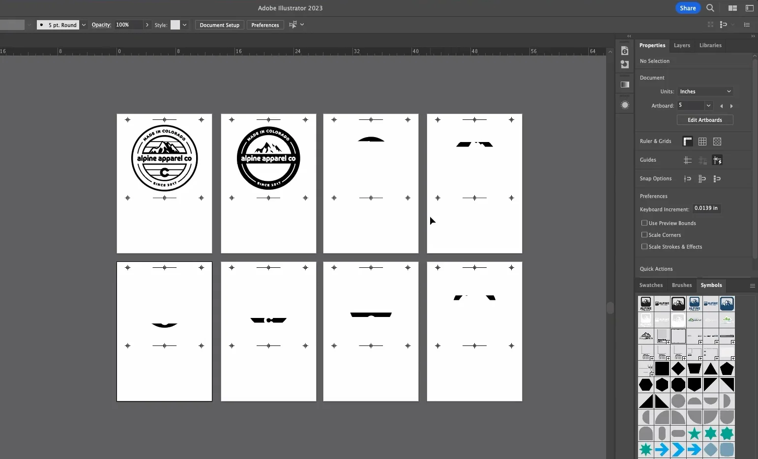
1. Review and Clean the Artwork
Check the file for stray paths, hidden objects, duplicate colors, transparency, gradients, tiny details, overlapping shapes, and live text. Clean artwork makes print colors easier to control.
Auto-traced artwork also needs close review. Anti-aliased edges can create similar shades and extra vector fills. Reduce unwanted colors and simplify rough paths before separation.
2. Identify the Actual Printing Colors
Decide which colors will use physical inks. A spot color represents a specific ink that prints separately instead of being built from process colors.
3. Assign and Organize Each Color
Group objects that use the same ink and assign consistent color values. Clear organization prevents similar shades from becoming accidental extra separations.
4. Create the Separate Color Layers
Then isolate each production color so it can become its own print separation. This information may later create a screen, plate, or output channel.
5. Preview Each Separation
Before final output, inspect every color on its own. A separation preview can reveal problems that are easy to miss in the full design.
Check for:
- Missing design elements
- Stray shapes or paths
- Unexpected colors
- Unwanted transparency
- Incorrect overlaps
Also confirm that overprinted objects behave as intended.
6. Prepare the File for Output
Finally, verify the finished size, color names, registration needs, and requested file format. Follow the printer’s specifications because output requirements can vary.
If the artwork is messy, pixel-based, or difficult to separate, send low quality artwork to Absolute Digitizing for clean vector conversion, ready for print production.
Watch this short and helpful video to see how colors are separated in Adobe Illustrator for cleaner screen printing preparation.
Which Type of Color Separation Should You Use?
The right separation method depends on the artwork, garment color, number of inks, and final print effect. Choosing the right method helps control color accuracy.
| Separation Type | Best For | Main Idea |
|---|---|---|
| Spot Color | Logos and flat graphics | Uses separate solid inks |
| CMYK Process | Full color images on light garments | Uses cyan, magenta, yellow, and black |
| Simulated Process | Detailed artwork, including dark garments | Uses selected spot inks and halftones |
| Index Color | Complex tonal artwork | Uses the same size pixels to build color and shading |
Spot color works well when a design needs clean, exact colors. CMYK builds a wider color range from four process inks, but the artwork and substrate must suit the method.
Meanwhile, the simulated process combines selected inks with halftones to create detailed images. Index separation uses fixed size pixels instead of traditional halftone dots.
Is Spot Color or CMYK Better for Vector Artwork?
Neither method is always better. Spot color often suits logos and simple graphics. However, CMYK can suit full color artwork. The best choice depends on color count, substrate, press setup, required color accuracy, and print method.
What Are Trapping, Choking, and Underbase in Color Separation?
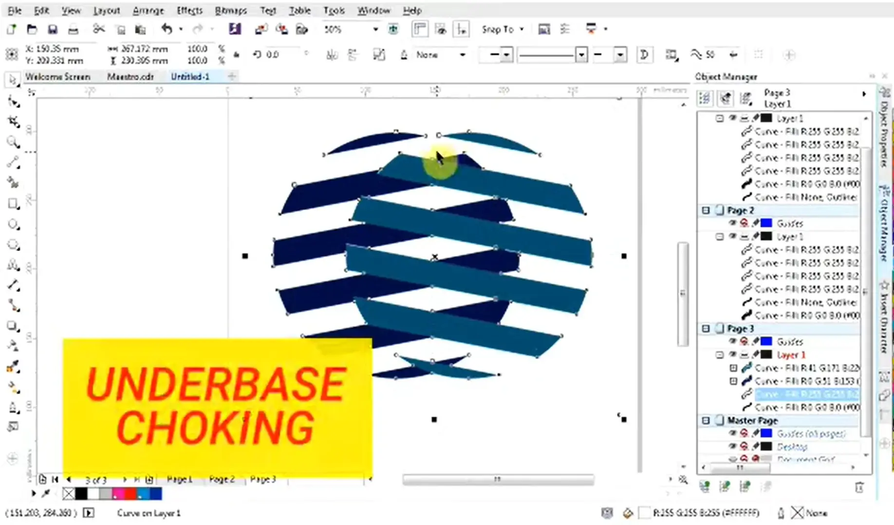
Trapping, choking, and underbase settings help colors print cleanly when screens must align. Small press movement can shift colors, so artwork often needs planned overlaps.
Why Do White Gaps Appear Between Separated Colors?
White gaps usually appear when adjoining colors fall slightly out of register. Trapping helps prevent this by creating a small overlap between them.
Common controls include:
- Spread expands a lighter color into a darker area.
- Choke reduces an underlying color so the top color covers its edge.
- Overprint lets one ink print over another instead of knocking it out.
However, one trap size does not suit every job. The right amount depends on the press, inks, substrate, mesh, and setup. Therefore, confirm trapping values with the print provider.
When Is a White Underbase Needed?
A white underbase is commonly used on dark garments to create an opaque foundation beneath brighter inks. It helps top colors stay vivid and consistent.
Meanwhile, the underbase often needs its own screen. Printers may choke it slightly so white edges do not show around the finished design.
What Happens to Gradients and Shadows During Color Separation?
Gradients and shadows need more planning than flat colors because a screen cannot print every visible shade as a separate solid ink. Instead, printers often use halftones to reproduce smooth tonal changes.
Can You Screen Print Gradients From Vector Artwork?
Yes. Halftones break a tone into tiny dots. Larger or denser dots make an area look darker, while smaller dots make it look lighter. From normal viewing distance, the eye blends them into a smooth transition.
Key Production Factors
- LPI, which controls halftone line frequency
- Screen mesh, which must hold the chosen dot size
- Ink, exposure, and press conditions
However, a higher LPI is not always better. Fine dots need suitable mesh and accurate exposure. Therefore, complex gradients need more testing and production planning than simple flat color artwork.
Why Does My Vector File Have Too Many Colors After Tracing?
Auto tracing a JPG or PNG can create more colors than the original design appears to have. Anti aliased edges contain blended pixels, and tracing software may turn those shade differences into separate vector fills.
How Can You Clean Up the Extra Colors?
Review the file before preparing it for print. Check swatches, fills, and shapes to find colors that do not belong.
Then:
- Merge near duplicate shades into the intended production color
- Remove stray objects and unnecessary paths
- Simplify rough or complex traced shapes
- Rebuild weak sections when tracing creates poor edges
- Reduce the file to the actual colors needed for production
As a result, the artwork becomes easier to separate, edit, and prepare for accurate printing.
What Common Color Separation Mistakes Cause Printing Problems?
Small file setup errors can create extra screens, registration issues, unexpected colors, or press corrections. A prepress check helps catch these problems before production.
Mistakes to Check Before Printing
- Leaving artwork in RGB or keeping unintended process colors can change output.
- Creating near duplicate shades can produce unnecessary separations.
- Ignoring transparency, blends, or overprint settings can change how overlapping colors print.
- Failing to inspect overlapping vector objects can cause hidden gaps or unwanted ink buildup.
- Skipping trapping or underbase planning can expose edges when screens shift.
- Using gradients without proper halftone planning can create rough tonal transitions.
- Missing registration marks makes it harder to align separate screens.
- Leaving live fonts can cause text changes when the printer lacks the typeface.
- Separating poorly auto traced artwork can carry stray paths and unwanted colors into production.
- Sending files without confirming the printer’s size, color, format, and output requirements can cause avoidable revisions.
Therefore, preview each separation and inspect overprints, transparency, and color assignments before delivery. Also confirm production specifications with the print provider, since press setups and output needs can differ.
What Should a Print-Ready Separated Vector File Include?
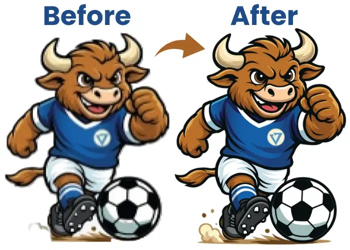
A print-ready separated vector file should give the printer clear, organized information without unnecessary cleanup. The final artwork should match the approved size and use only the colors needed for production.
Final File Checklist
- Correct final dimensions
- Clean vector paths
- Intended production colors
- Clearly named color swatches
- Organized color separations
- Fonts outlined or properly packaged
- White underbase when required
- Correct trapping and choking
- Registration marks when needed
- No unintended transparency
- Suitable output file format
- Reference preview of the finished design
However, one setup does not work for every printer. Halftone frequency, trapping values, printer marks, file format, and output settings can change with the press and workflow.
Therefore, confirm the printer’s specifications before sending the final file. A short prepress check can prevent color errors, missing elements, and avoidable production delays.
Final Thoughts
Color separation starts with clean artwork and the right print method. Spot colors, process printing, halftones, underbases, trapping, and registration all affect how well the final design prints. Careful file cleanup and a final prepress check can prevent extra colors, gaps, and production delays.
For dependable print-ready artwork, contact Absolute Digitizing for professional vector art services and get a free quote for your project.
Frequently Asked Questions
For simple spot-color printing, each spot ink normally needs its own screen. However, CMYK, simulated process, and halftone methods can create more visible colors by combining inks or dot patterns.
Neither method is always better. Spot colors work well for logos, flat graphics, and precise brand colors. CMYK suits many full-color images. The right choice depends on the artwork, garment, press setup, and desired result.
Yes. Screen printers usually reproduce gradients with halftones. Tiny dots vary in size or spacing to make areas appear lighter or darker. The correct LPI and screen mesh are important for holding those details.
Small registration shifts can create visible gaps or unwanted overlaps between colors. Proper registration, trapping, choking, and accurate screen setup help reduce these problems during production.
Yes. High-quality raster artwork can be separated without always converting it to vector. However, simple logos and flat graphics often benefit from clean vector artwork because individual shapes and colors are easier to control.