Where a Screen Print-Ready File Is Required
Apparel Printing
You need a screen print-ready file for custom T-shirts, hoodies, and sweatshirts because printing shows every small flaw. The same applies to uniforms for schools, sports teams, and staff apparel where logos must look consistent across every piece.
Events and Bulk Orders
Event merch for concerts, sports events, and corporate events often runs on tight deadlines, so printers need clean artwork that does not require fixing. Bulk orders make it even more critical because one mistake can affect dozens or hundreds of items and lead to costly reprints.
Brands, E-commerce, and Promotions
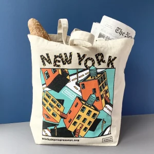
Brand merch drops and e-commerce apparel require sharp, professional prints because customers notice quality immediately. Promotional items like tote bags, caps, and aprons also need clean shapes and solid colors to print well on different materials.
Professional Print Shops
Most print shops ask for clean artwork and proper separations. A screen print-ready file helps you avoid file rejection, extra artwork charges, and production delays.
What Screen Printers Actually Need From You

Clean Color Separations
Screen printers need artwork that separates cleanly into screens because each ink color usually needs its own screen. Your file should make those separations simple and obvious, not confusing or mixed..
Consistent Colors and Clean Shapes
Use solid, consistent colors and sharp edges. Avoid “almost the same” shades, heavy gradients, blurry shadows, and textured effects unless you know the printer can handle them. Clean shapes help the ink print crisp and even.
Art File vs Production File
An art file is made for viewing, like a screenshot or a low-res PNG. A production file is made for printing. It includes the correct final size, clean vector paths, outlined text, and a clear color setup so the printer can print without guessing or fixing your file.
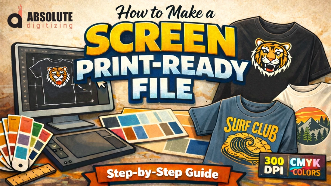
How to Make a Screen Print-Ready File
Choose the Right File Type
Set the Correct Size and Placement
Fonts, Strokes, and Outlines
Convert Text to Outlines or Curves
Always convert fonts to outlines before you send artwork to a printer. If you leave live text in the file and the printer does not have your exact font, the design can shift, substitute, or break. Outlining locks the lettering shape so it prints exactly as you intended.
Expand Strokes for Consistent Thickness
Strokes can change when someone scales the file or opens it in a different program. Expand strokes to turn them into solid shapes. This keeps line weight consistent and prevents unexpected thick or thin outlines in the final print.
Avoid Hairlines and Tiny Gaps
Screen printing uses ink pushed through a mesh, so very thin lines and tiny gaps can fill in. Hairline strokes may disappear, and small openings inside letters can close up. Keep enough thickness and spacing so the design holds up on fabric.
Save an Editable Copy First
Before you outline text or expand strokes, save a separate editable version of your file. This lets you change spelling, adjust font choices, or update layout later without rebuilding the artwork from scratch.
Color Setup for Screen Printing

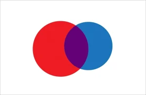
Spot Colors vs CMYK (What Most Screen Printers Prefer
Most screen printers prefer spot colors because they print one solid ink at a time, using a separate screen for each color. CMYK (the four-color process used for photo-style prints) can work, but it usually needs tighter control, more setup, and often does not look as clean on fabric as simple spot colors. If your design is a logo, text, or a bold graphic, spot colors are usually the safest choice.
Why Fewer Colors Means Lower Cost
Here’s the simple rule: fewer colors = fewer screens = lower cost. Each additional color usually means another screen, extra setup time, and more chances for misregistration (colors not lining up perfectly). If you can simplify the design from 6 colors to 3, you often save real money without losing the look.
Use Pantone or Clearly Named Spot Colors
If you want accurate color matching, use Pantone (PMS) codes or clearly named spot colors like “Red,” “Navy,” or “Gold.” Don’t leave it to guesswork. Also, avoid tiny color variations that look different on-screen but print as separate inks.
Be Careful with Gradients, Shadows, and Textures
Gradients, soft shadows, and textured effects can force a printer into halftones or CMYK-style processing. If you need that look, discuss it early, or convert it into a screen-print-friendly style (solid shapes, clean shading, and limited tones).
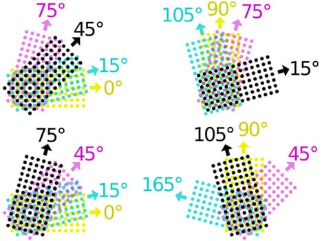
Color Separation Basics (The Core of “Print-Ready”)
How to Export a Screen Print-Ready File
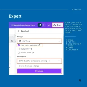
Illustrator / Corel / Inkscape Export Tips
For most screen printers, the best exports are vector-based files that keep shapes crisp at any size. Use AI, EPS, or PDF and make sure vectors stay as vectors (not flattened into an image). Before exporting, convert text to outlines if requested, and keep strokes expanded when needed so thickness stays consistent. If your design includes any placed images, embed them instead of linking, so the printer does not receive missing files. Also confirm your document still uses spot colors (Pantone or clearly named spot swatches) rather than random RGB values, because spot colors are easier to separate for screens.
File Naming + Reference Mockup
Name files clearly, And always include a reference mockup image (JPG/PNG) showing how the final print should look, especially if there are multiple versions or placements. This prevents misunderstandings and speeds up approvals.
Quick Print-Ready Checklist
-
Confirm the final print size is set correctly in the file.
-
Do not assume the printer will resize it without issues.
-
Use vector artwork whenever possible for sharp edges.
-
Preferred formats: AI / EPS / PDF / SVG (vectors preserved).
-
Keep colors limited to reduce screens and cost.
-
Define colors as spot colors (Pantone or clearly named swatches).
-
Convert all text to outlines to prevent font problems.
-
Expand strokes so line thickness stays consistent.
-
Keep clean layers per color to support proper separations.
Why Hire Professional Vector Artwork Services
Conclusion
Getting a design “print-ready” is not about making it look good on a screen. It is about making it easy and reliable to print with clean edges, correct sizing, and colors that separate properly. When you use the right setup (spot colors, clear layers, outlined text, and clean vectors), you reduce delays, avoid extra charges, and get consistent results on every batch. If your artwork is simple, you can often prepare it yourself by following the checklist. But for complex designs, tight deadlines, or bulk orders, professional vector art services and separation help usually saves more money than it costs. In the end, print-ready files mean faster approvals, smoother production, and better-looking prints that customers actually want to wear.
Get an Instant Free Quote for Vector Artwork Conversion from Absolute Digitizing.