
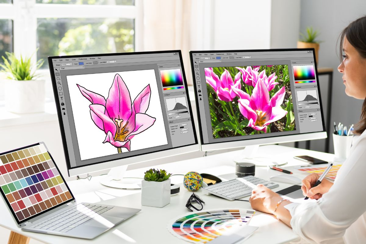
A design can look perfect on your computer screen and still sew out badly on fabric. That is because embroidery is not printing. Thread pulls. Fabric stretches. Stitches sink. Small details that look sharp in preview can turn into gaps, bumps, and messy outlines.
Embroidery Digitizing like a pro is not about talent. It is about using a system. A pro file runs predictably. Clean edges hold their shape. Thread breaks become rare. Trims stay under control. Shapes line up the way they should.
In this guide, you will learn a repeatable workflow you can use every time. First comes artwork prep. Then you build the stitch plan and set underlay and density. After that, you test on real fabric and fix what the sew-out reveals. If you are digitizing for customer orders or production, hiring professional services can also be a smart move. It often costs less than trial and error. It cuts down failed tests, wasted stabilizer, and rework.
- What You Need Before You Start (Tools + Setup)
- Start Like a Pro: Artwork Prep That Prevents 80% of Problems
- The Pro Mindset: Digitize for Fabric, Not for the Screen
- Choose the Right Stitch Types (and When to Avoid Them)
- Underlay: The “Invisible” Part That Makes It Look Expensive
- Density, Pull Compensation, and Stitch Length: The “Settings Trio”
- Text Digitizing
- Testing Like a Pro: Sew-Out Checklist
- Pro Workflow Summary: Your Repeatable “Digitizing Recipe”
What You Need Before You Start (Tools + Setup)

A) Hardware Basics
Your machine type affects how you digitize. A multi-needle machine handles color changes smoothly, so sequencing can be more flexible. A single-needle machine can slow down with frequent color changes, so you usually plan cleaner paths and fewer stops.
Hooping and stabilizer choice also matters more than most people expect. If the hoop tension is wrong or the stabilizer is too weak, the design can shift, pucker, or lose clean edges even when the file is well made.
B) Software Basics
Digitizing software falls into two main categories. Full digitizing suites give you real control over underlay, density, stitch angles, pull compensation, and trims. “Auto” digitizing tools can be useful for quick starting points, but they often guess wrong on stitch types and underlay. That is why auto results usually need manual fixing before they sew out clean.
C) File Basics
DST is the most common embroidery file format for production. PES, EXP, VP3, and others depend on the machine brand. It also helps to keep a clean “master” file, not just the export. A master file protects quality when you resize, edit, or change details later.
Soft Tip
If you digitize only once in a while, outsourcing a strong master file can be the most economical choice compared to buying expensive software.
Start Like a Pro: Artwork Prep That Prevents 80% of Problems
1) Start With the Cleanest Artwork You Can
Use a clean vector file when possible (AI, EPS, SVG, or a good PDF). Vectors give smooth edges and clear shapes. If you only have a JPG or PNG, enlarge it first, then clean it up. Remove jagged edges, blur, and tiny specks. Those small flaws often turn into rough outlines and unnecessary stitch points.
2) Decide the Final Size First
Pick the real placement before digitizing. A left chest logo, a cap front, and a full front design need different planning. Smaller sizes demand simpler shapes and smarter stitch choices. If you digitize first and resize later, details can break fast.
3) Simplify Tiny Details Before They Fail
Keep lines thick enough to stitch cleanly. Avoid micro-text and ultra-thin borders. If a detail will not read at the actual size, it should be removed, enlarged, or redesigned.
4) Separate Colors and Assign Stitch Types Early
Plan what will be satin (text, borders), what will be fill (large areas), and what will be running stitch (fine outlines and small details). This makes the stitch plan cleaner and the sew-out more stable.
5) Match the Design to the Fabric
Pique polos, fleece, twill, and caps all behave differently. Fabric choice affects underlay, density, and even sequencing.
Soft Tip
A professional digitizer often spots “impossible details” early, which can save thread, stabilizer, and repeated test runs.
The Pro Mindset: Digitize for Fabric, Not for the Screen
![]()
1) Expect Controlled Distortion
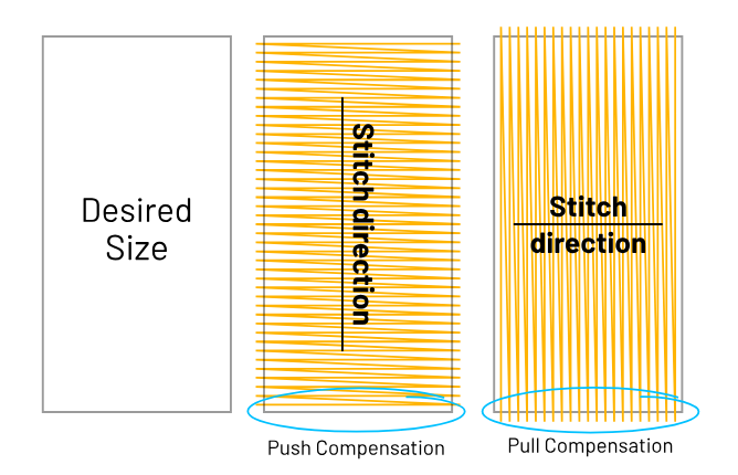
Embroidery is not perfectly “accurate” like printing. Thread pulls fabric inward and stitches can push shapes outward. That is why push and pull compensation is normal. If you digitize only to match the screen preview, the sew-out can shrink, warp, or show gaps.
2) Build Structure, Not a Drawing
A professional file is built in layers. Underlay is the foundation that stabilizes the fabric and supports the top stitches. Top stitching is the visible layer that creates clean edges and smooth coverage. When the structure is strong, the design stays sharp and runs with fewer issues.
3) Use Stitch Direction Like Lighting
Stitch direction is not only about coverage. It controls how light reflects off thread, which changes the look of the same color. Smart angle choices help separate areas, add depth, and keep shapes readable, even from a distance.
Choose the Right Stitch Types (and When to Avoid Them)
A) Running Stitch
Running stitch is best for clean outlines, light details, and travel lines that connect areas without adding bulk. It is also useful for small elements where satin would be too heavy. The risk shows up when you use long running stitches on stretchy fabric. Those long lines can look wavy, sink into the knit, or shift after washing. In those cases, shorter segments, better underlay support, or a different stitch type is often safer.
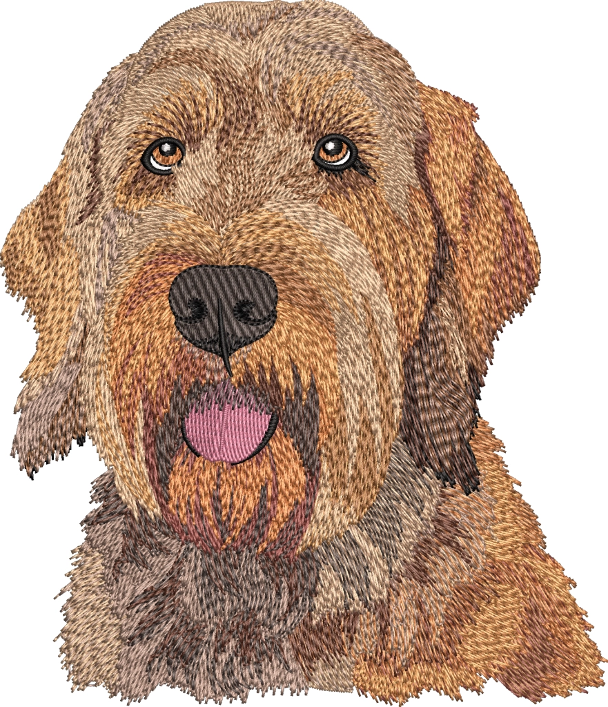
B) Satin Stitch
Satin stitch is the go-to choice for borders, lettering, and smooth columns because it looks crisp and slightly raised. It is ideal for medium-size text and strong outlines. But satin has practical limits. If a column is too narrow, stitches get too short and can cause thread breaks. If a column is too wide, the long stitches can snag and the surface can look loose. When satin is beyond its range, splitting the area or switching to fill can prevent problems.
C) Fill (Tatami) Stitch
Fill stitches are made for larger areas and solid shapes. The key decisions are density, stitch angle, pattern type, and clean endings so you do not leave rough edges or holes. A well-planned fill also supports borders and keeps fabric stable.
Soft tip: Professionals choose stitch types based on fabric and final size, so the design stays readable and durable even after repeated washing.
Density, Pull Compensation, and Stitch Length: The “Settings Trio”
These three settings decide whether your design looks smooth and professional or rough and problematic. Small adjustments here can fix issues faster than changing the whole design.
A) Density
Density is how closely stitches sit next to each other. Too dense and the design becomes stiff, causes puckering, and may even trigger thread breaks. Too light and you will see gaps, fabric peeking through, and weak coverage. As a simple rule, aim for medium density first, then adjust after a test sew-out. Large fills usually need slightly lighter density than satin areas.
B) Pull Compensation
Outlines often shrink inward because thread tension and fabric pull make shapes tighten during stitching. Pull compensation pushes borders slightly outward in the file so they sew out at the correct size. Use it carefully. Add small increases for borders and lettering, especially on stretchy fabric. Avoid overdoing it, or the design will look bloated and “puffy” around edges.
C) Stitch Length
Very short stitches can chew the fabric and increase thread breaks, especially on tight curves or tiny text. Very long stitches can snag, look loose, and fail to cover evenly. A safe approach is to keep most stitches in a medium range, and only shorten them slightly on curves where you need detail.
Rule of thumb: start moderate, then always test on the same or similar fabric and stabilizer you plan to use in real production.
Text Digitizing
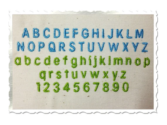
Text is where many designs fail first, because letters are small and unforgiving. As a rule, keep most lettering around 5–6 mm (about 0.20–0.25 in) or larger for clean results on typical fabrics. When text gets too small, stitches crowd together, details disappear, and letters turn into blobs after washing. Caps and textured fabrics often need even larger text to stay readable.
Choose stitch type based on size. Satin works well for medium text because it looks crisp and raised. For very small text, running stitch (or a light column/running style) can be safer than forcing tiny satin columns that cause thread breaks. Also choose fonts made for embroidery. Thin serif fonts may look elegant on screen, but the tiny points and hairlines usually stitch poorly at small sizes.
Give letters breathing room. Increase spacing slightly and use pull compensation so edges do not shrink inward. Finally, always test stitch-out the text first before finishing the full design. Text errors are easier to fix early.
Soft tip: If your designs are text-heavy (uniforms, names, caps), a professional digitized file can prevent costly rework and wasted items.
Testing Like a Pro: Sew-Out Checklist
Always test your design the same way it will be used in real life. That means real size, real fabric, and the same stabilizer and hooping method you plan to use for production. A file that looks perfect on one fabric can fail on another, so testing on “something close enough” often creates false confidence.
During the sew-out, watch for common warning signs:
-
Puckering: fabric gathering around fills or borders
-
Gaps on curves: circles and rounded corners showing fabric through the edge
-
Misalignment at borders: outlines not sitting exactly on top of the fill
-
Thread breaks: frequent snapping, fraying, or shredding
-
Too many trims/jumps: messy stitch travel, slow runtime, untidy back
After the test, do not rely on memory. Keep a simple log so you can improve faster. Note the fabric and stabilizer used, plus any changes you make to density, underlay type, pull compensation, and stitch length. Over time, this becomes your personal “pro settings” library and reduces guesswork.
Pro Workflow Summary: Your Repeatable “Digitizing Recipe”
Use the same proven workflow every time so results stay consistent. Start with artwork clean-up, then decide the final size and placement. Next, build a stitch map plan (what is satin, fill, and run), then set the underlay to match the fabric. After that, fine-tune the core settings like density and pull compensation, and plan smart sequencing to reduce trims and improve registration. Then do a test sew-out on the real fabric and stabilizer, refine what the stitch-out reveals, and finally export the production file.
Once you get a design running clean, save those settings as a template. Reusing proven setups for similar fabrics and sizes will speed up your digitizing and reduce failed tests.
Conclusion
Embroidery digitizing like a pro comes down to planning and testing, not guessing. Clean the artwork, choose stitch types with purpose, build strong underlay, and fine-tune density and compensation based on real sew-outs. Start with simple designs, then reuse what works by saving templates for similar fabrics and sizes. Every test you run builds your “pro” library and reduces mistakes over time. And when the job is customer-facing, complex, or time-sensitive, outsourcing to professional embroidery digitizing services can be the fastest way to get consistent, production-ready results without burning hours on trial and error.
Get your instant free quote now at Absolute Digitizing.